
Year
2025
Industry
Healthcare, Accessibility
Category
Branding, Advertising, Motion Graphics
Introduction
Rethinking sexual wellness through inclusivity
FeelGood comes from the need to break taboos related to sexual wellness, turning prevention into a universal experience without barriers. The project starts with a constructive provocation: how can we make a protection device accessible to everyone, including the visually impaired, while communicating safety and positivity? In a sector often dominated by visual stereotypes or a purely clinical approach, the brand positions itself as an empathetic and conscious alternative. It is a concept designed to talk to a wide audience, using irony and inclusivity to normalize a fundamental act.

Challanges
Transforming accessibility into visual identity
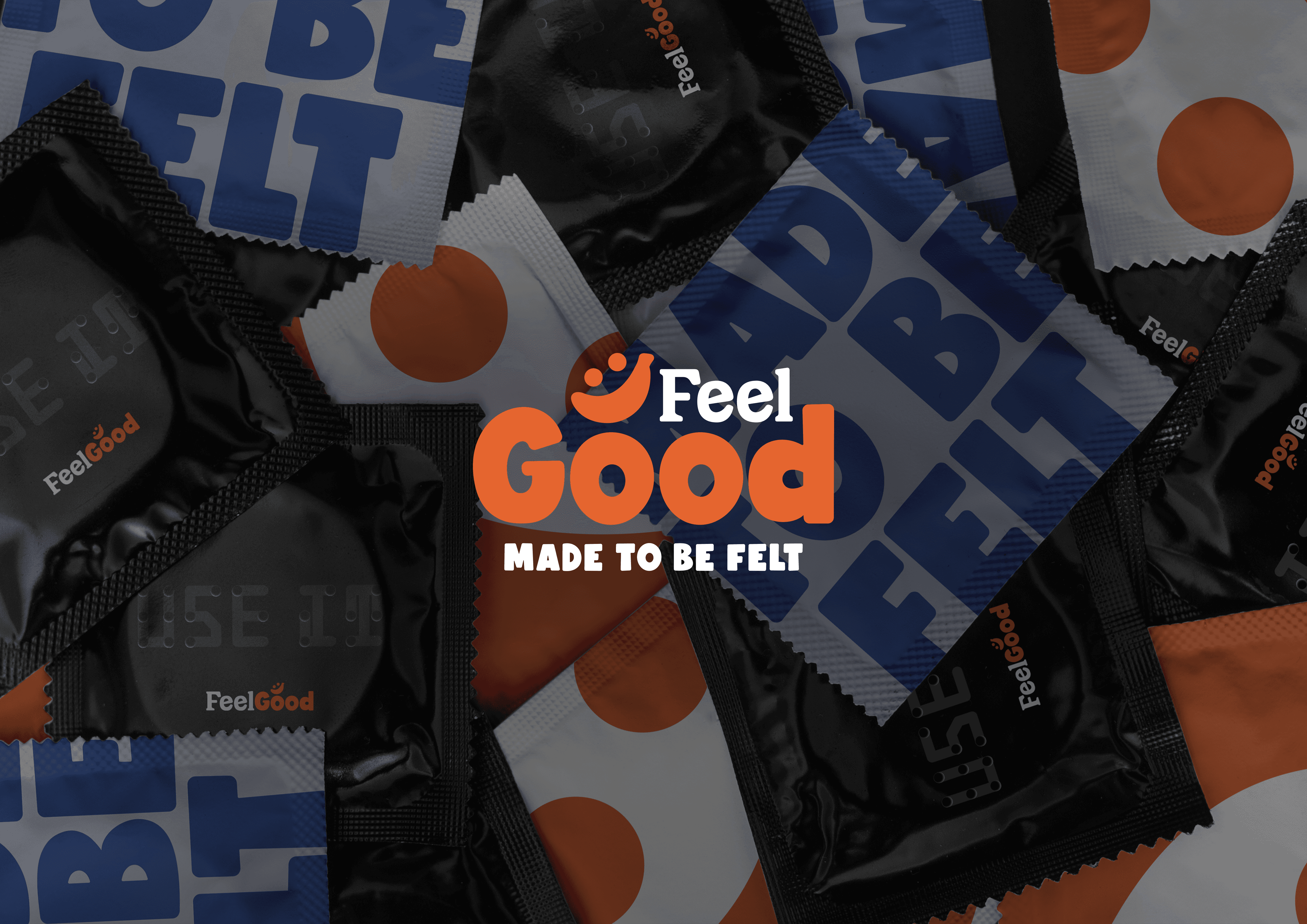
The visual and conceptual heart of the project is the use of the Braille Neue font (designed by Kosuke Takahashi), which perfectly blends visible characters with tactile writing. This choice is not just aesthetic, but structural: it sends the message that safety should be something you can "touch with your own hands." The identity uses a bold visual language based on contrasts. The almost retro softness of the typography meets a palette of saturated, strong, and contemporary colors. The design avoids embarrassment and builds a pop and sincere aesthetic, turning the packaging into a real communication object.

Final thoughts
Building a bold and cohesive brand system
The design solution results in the development of a complete visual ecosystem: art direction, packaging, copy strategy, and motion design for the logo animation. The brand presents itself with a direct personality, guided by clear claims like "Made to be felt" and "Safety is for everyone." The communication follows the product across every touchpoint, maintaining a tone of voice that doesn't take itself too seriously but delivers a very strong message. FeelGood is not just a style exercise, but a statement: protection is a right for everyone, to be lived and shown with pride.


